Use clip-path when...
You need hard geometric shapes, angled sections, circles, diamonds, or polygon-based hover effects.
Advanced CSS Demo
Both properties hide parts of an element, but they do it in different ways. Clip paths create hard geometric edges, while masks create soft transparency.
Demo 1
Click each button to change the visible shape of the same image.

clip-path: circle(42%);
Demo 2
Hover over the image. The polygon animates because both shapes use polygon() with the same number of points.
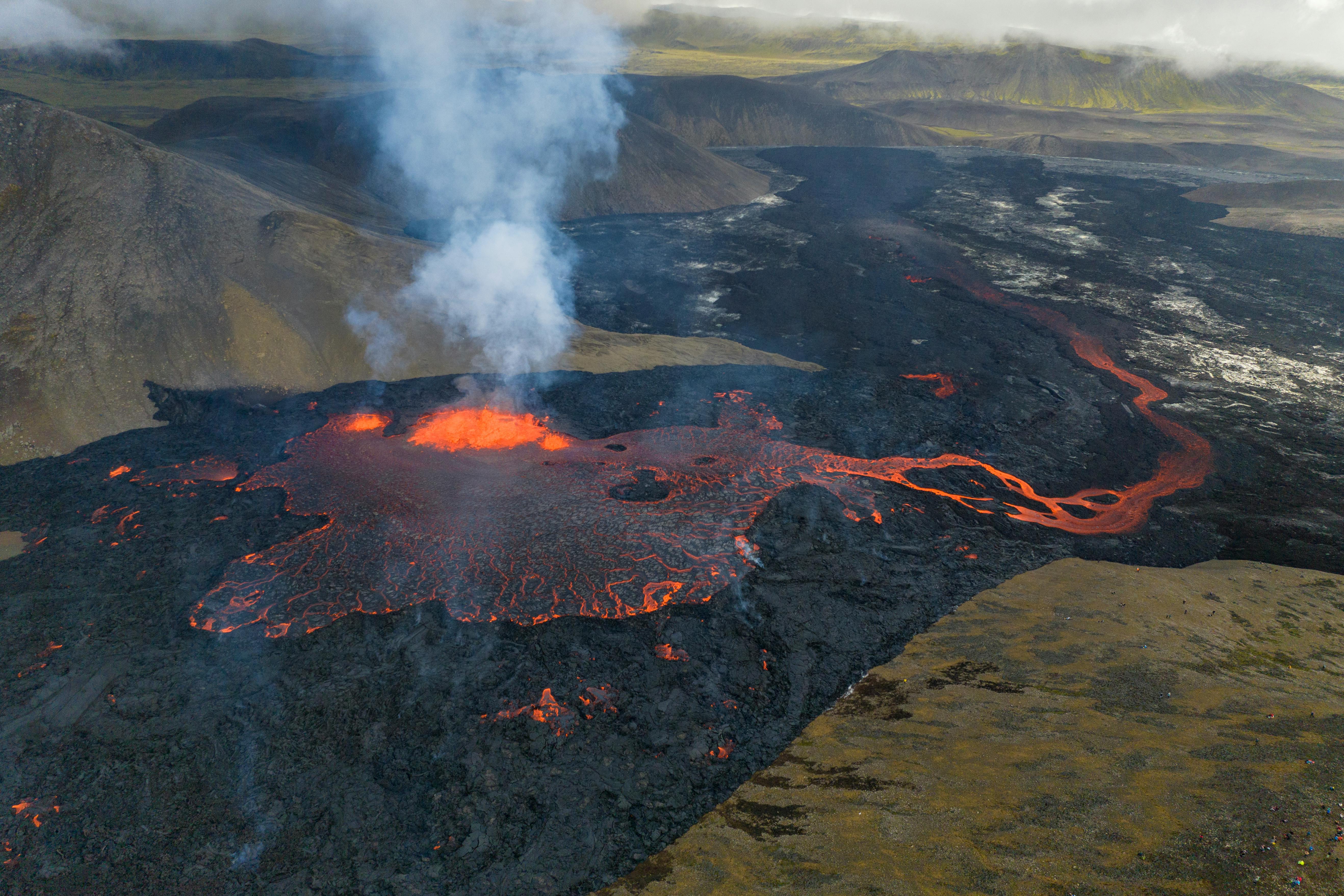
transition: clip-path 0.5s ease;
Demo 3
This image uses a gradient mask so the bottom edge fades out instead of ending with a hard cut.

              mask-image: linear-gradient(to bottom, black 55%, transparent
              100%);
You need hard geometric shapes, angled sections, circles, diamonds, or polygon-based hover effects.
You need soft fades, gradual transparency, vignettes, or image-based reveal effects.